The office
In the advertising business, clients usually want things to go big. They want their products to fill as much ad space as possible. Bigger, in other words, is almost always better.
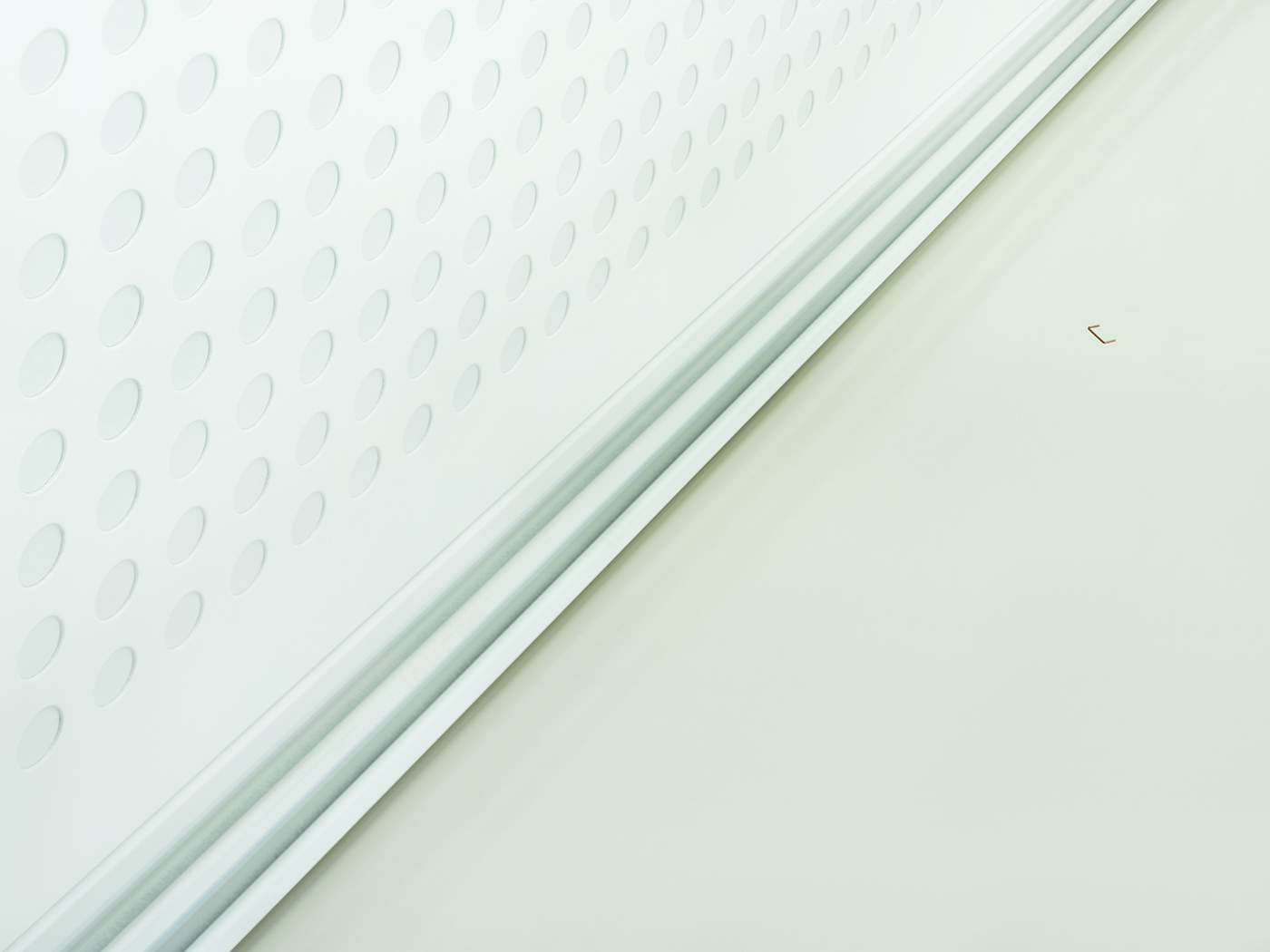
Here, in this personal visual experiment, I tried the opposite by asking the question: how small can the product be in a composition without taking away the image’s attractiveness?
In these images, there’s no doubt that the eye moves immediately to the staple, the rubberband, and the foam. Without these visual cues, the viewer is left to drift. See? Size doesn’t always matter.


